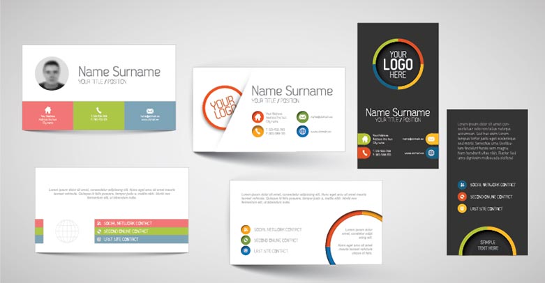
Although the world is going paperless, there is one mainstay – business cards. Having a business card is important especially during networking events. Your business card will represent you and the business you are doing so you must create it finely.
If you want to stand out, there are two things that you can try – visit https://www.joindesign.com/en/business-cards or create the card on your own. Whatever you consider, you must learn the basics of business card design so you can make it look professional. Here are some things you have to learn about business card design:

Be familiar with the standard specifications of the business card
You have to keep in mind the following specifications:
- The key copy should be at least 5mm from the edge of the trim.
- For the best image reproduction, you should choose 300dpi.
- Maintain a minimum size for your typography. This is to ensure legibility.
- If you are not working exclusively with spot colors, you should design with CMYK in mind.
- Use a grid to layout your business card. In the end, this can help you achieve the right order of information. Aside from that, the grid can also ensure alignment.
Get creative with the available space
There are many standard sizes for business cards and it is usually based on the region you are working but in general, the typical business card size is 55 x 85mm. When you think about it, this is a tiny canvas but you still have to be creative and work with whatever available space you have.
The important thing here is you know what information goes to the card. You should start with the key information you want to include like the name, phone number, email address, social handles, and the designation. Do not overwhelm the space with unnecessary information because clutter is unattractive.
Be aware of common pitfalls
When designing a business card, there are common pitfalls to be aware of. Common pitfalls include the following:
- Make sure to provide bleed as specified by the printer – 3mm is common but it should be 5mm. With this in mind, it is important to check it at the onset.
- Do not use a straightforward border around the entire card because it will show up misalignment when it comes to the trim.
Think about a special finish
If you want to add impact to your business card immediately, you have to think about a special finish. The special finish will include spot-UV or foil blocking, metallic inks and many more. Your goal here is to make your card more memorable and impressive.
Final words
At the end of the day, you are missing out on many marketing opportunities without handing out your business cards to prospective clients and collaborators. Just like a business card, there is also one marketing material that you should emphasize – the restaurant menu. For designing a restaurant menu, you can visit https://www.joindesign.com/en/restaurant-menu.


